Tips for Choosing Calm Colors for Your Home
Creating a calm and peaceful environment at home starts with your choice of colors. Colors have a powerful effect on our mood and energy, and selecting the right calming hues can transform your living space into a tranquil retreat. Whether you want to refresh a single room or reimagine your entire home, this guide offers practical tips to help you choose calm colors that foster relaxation and serenity.
Why Choose Calm Colors?
Before diving into specific tips, it’s helpful to understand why calm colors matter. Colors influence how we feel—certain tones can energize us, while others can soothe and reduce stress. Calm colors are typically soft, muted, or cool shades that create a sense of peace and balance. Using these tones in your decor supports well-being and makes your home a comfortable place to unwind.
Popular Calm Color Choices for the Home
Here are some commonly favored calm colors:
– Soft Blues: Evoke the sky and sea, helping to lower heart rate and promote relaxation.
– Gentle Greens: Remind us of nature and growth, offering a refreshing and reassuring vibe.
– Muted Lavenders: Provide a subtle touch of color that feels restful and gentle.
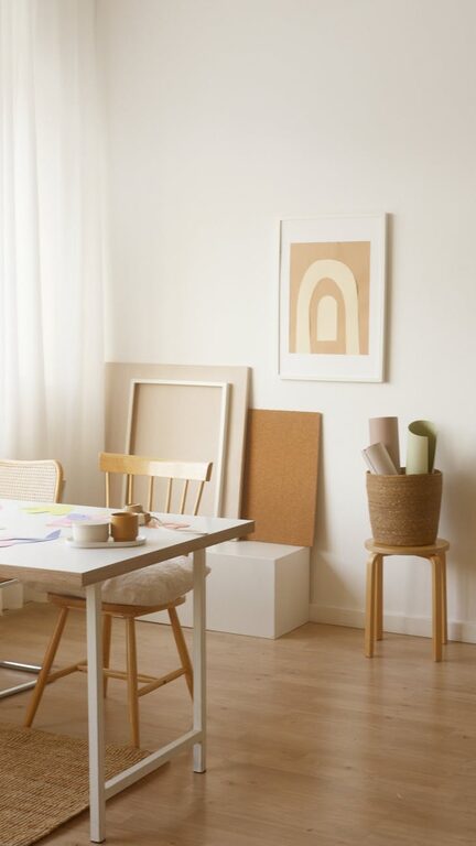
– Warm Neutrals: Shades like beige, taupe, and soft greys create warmth without overwhelming the senses.
– Pale Pinks: Give a cozy and nurturing atmosphere without being too bold.
Tips for Choosing Calm Colors
1. Consider the Room’s Purpose
Think about how each room is used. Bedrooms and bathrooms are places for rest and rejuvenation, so soft blues, greens, or greys work well here. Living rooms and kitchens often benefit from warm neutrals or muted colors that encourage conversation without overstimulation.
2. Test Colors in Different Lights
Lighting affects how colors look. Natural daylight shows colors differently than artificial lighting. Paint sample swatches on your walls and observe them at various times of the day to ensure the color maintains its calm effect in all lighting conditions.
3. Use Color Palettes for Balance
Choosing an entire palette rather than a single color helps create a cohesive look. Calm color palettes usually combine a primary calming color with soft accent tones. For example, a pale blue paired with light beige and white trim feels fresh and serene.
4. Opt for Matte or Satin Finishes
Glossy paints can reflect light and create sharper, more energetic spaces. To maintain a calm ambiance, select matte or satin finishes that diffuse light softly and support the soothing feel of the colors.
5. Incorporate Natural Elements
Complement calm colors with natural materials such as wood, stone, or plants. These textures and colors enhance the peacefulness of your palette and provide grounding elements within your space.
6. Keep Contrast Low
High-contrast color combinations can be stimulating. When aiming for calmness, pick shades with subtle variations rather than bold opposites. For example, soft grey paired with a light blush is gentler than dark grey with bright pink.
7. Use Color Psychology as a Guide
Understanding basic color psychology can inform your choices. Blue is known for calming effects, green for restoration, and soft neutrals for warmth and comfort. Choose colors aligned with the emotional experience you want in each space.
8. Don’t Forget the Accent Colors
While calm colors dominate, small pops of gentle accent colors can add interest without disrupting tranquility. Think of pastel cushions, muted artwork, or subdued patterned rugs to keep the space visually appealing.
9. Match Colors to Your Personality
Calm does not mean boring. Choose quiet colors you personally enjoy and feel drawn to. Your comfort and connection to the colors create the most effective calm environment.
10. Plan Your Color Flow
If your home has an open floor plan or adjacent rooms, consider how colors flow from one space to another. Use related calm colors to create harmony throughout, ensuring one room’s palette blends smoothly into the next.
Final Thoughts
Choosing calm colors for your home is a thoughtful way to enhance your living space and promote relaxation. By considering the purpose of each room, testing colors in different lighting, and balancing your palette with textures and finishes, you can create a serene environment that feels welcoming and peaceful. Remember, the best calm colors are those that resonate with you personally and make your home a restful haven.
Start with small steps—try painting a single accent wall or adding calming accessories—and gradually build towards a color scheme that brings peace and comfort to your daily life. With these tips, designing a soothing space is both manageable and enjoyable.